

We’ve tackled doomed gadgets, failed strategies, and tech villains, but today we’re putting a font on trial.
Yes, a font.
Because few design choices have done more lasting damage to human dignity than Comic Sans.
Created in 1994 for Microsoft’s “Bob” project (a cartoon dog meant to make Windows more “friendly”), it was supposed to be lighthearted filler text. The designer, Vincent Connare, even admits he only used it once. Once! And yet, like an office party email gone rogue, it spread everywhere.
Before long, Comic Sans was stapled to every school newsletter, every “Please wash your dishes” sign in the office kitchen, and — unbelievably — even gravestones. (Imagine your eternal rest announced in a font that screams “primary school book fair.”)
It is the font of misplaced enthusiasm, the typeface equivalent of a dad joke told at a funeral. It was never meant to be taken seriously, but people did — and that’s the problem.
And so, here we are. Decades later, still haunted by a font that was designed as a joke but became a plague. If technical debt is about bad decisions compounding, Comic Sans is aesthetic debt on a global scale.
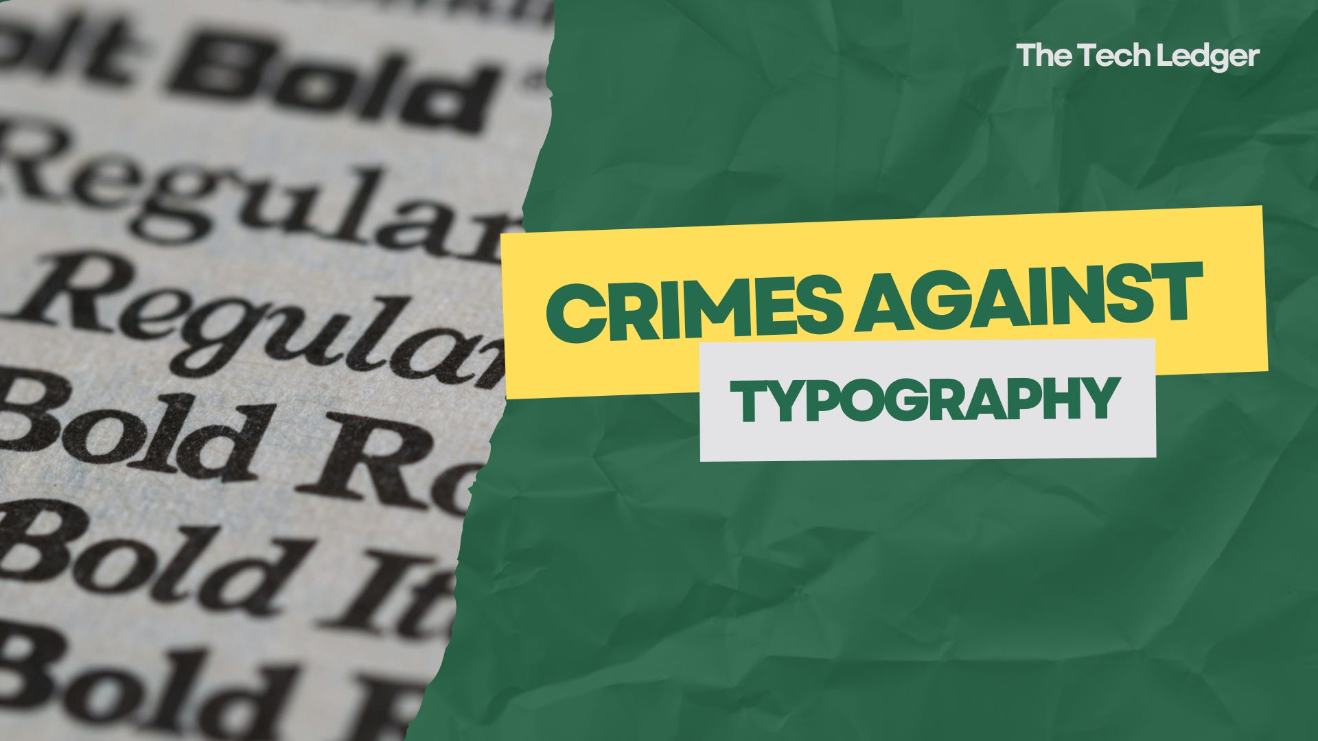
Ledger entry: Comic Sans, guilty of crimes against typography, sentenced to life in clip-art purgatory.
But here’s the real question: is Comic Sans the worst font ever… or do you have another contender for the hall of shame?